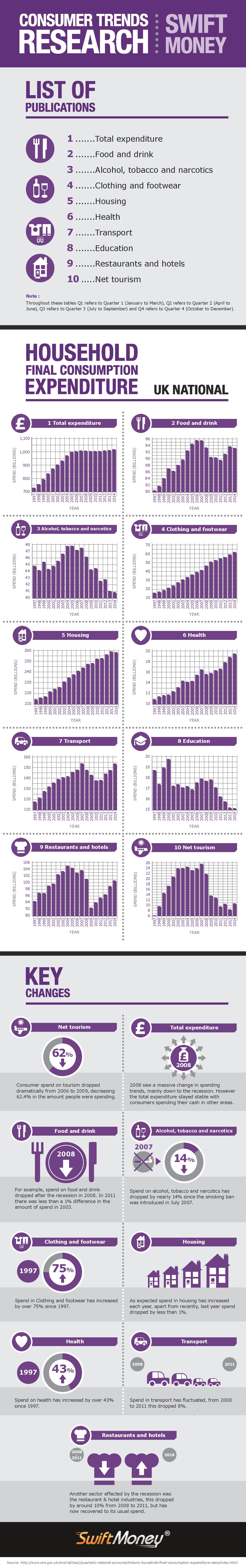
Living your daily life needs money, but in what areas have the expenditures changed a lot, and in what areas almost not at all? You can see a few things in the infographic, but it's interesting to see that, while inflation should be theoretically bringing the prices up, when you look at food and drink, people spent almost the same amount of money on it in 2003 and 2011. The graphs also show that people are living just a bit healthier lifestyles, possibly, with the spend on alcohol, tobacco, and narcotics down by 14% since July 2007. See more from the infographic below.
Infographic created by swift money.
Infographic created by swift money.
|
Some of our content may be related to gambling.   |